Toledo Museum
of Art
Brand Identity, Motion, Website
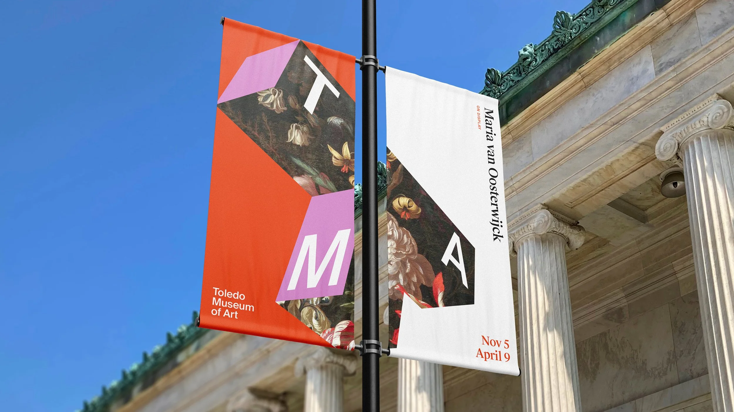
Art is never static. It’s always dynamic. Our perspective shifts as we cross the room or reassess our views over time. The new TMA logo is a dynamic, multifaceted icon. A symbol of the continual reframing of the history of art. A symbol that evokes the dynamism of art’s emerging future.
The letter “T” becomes a symbol for reflecting and celebrating diverse views. It reflects the museum architecture, yes, but also – like Toledo itself – keeps evolving, incorporating new voices and fresh perspectives. The ”T” is drawn from the campus footprint, putting the museum in constant conversation with the ever-evolving future of art.
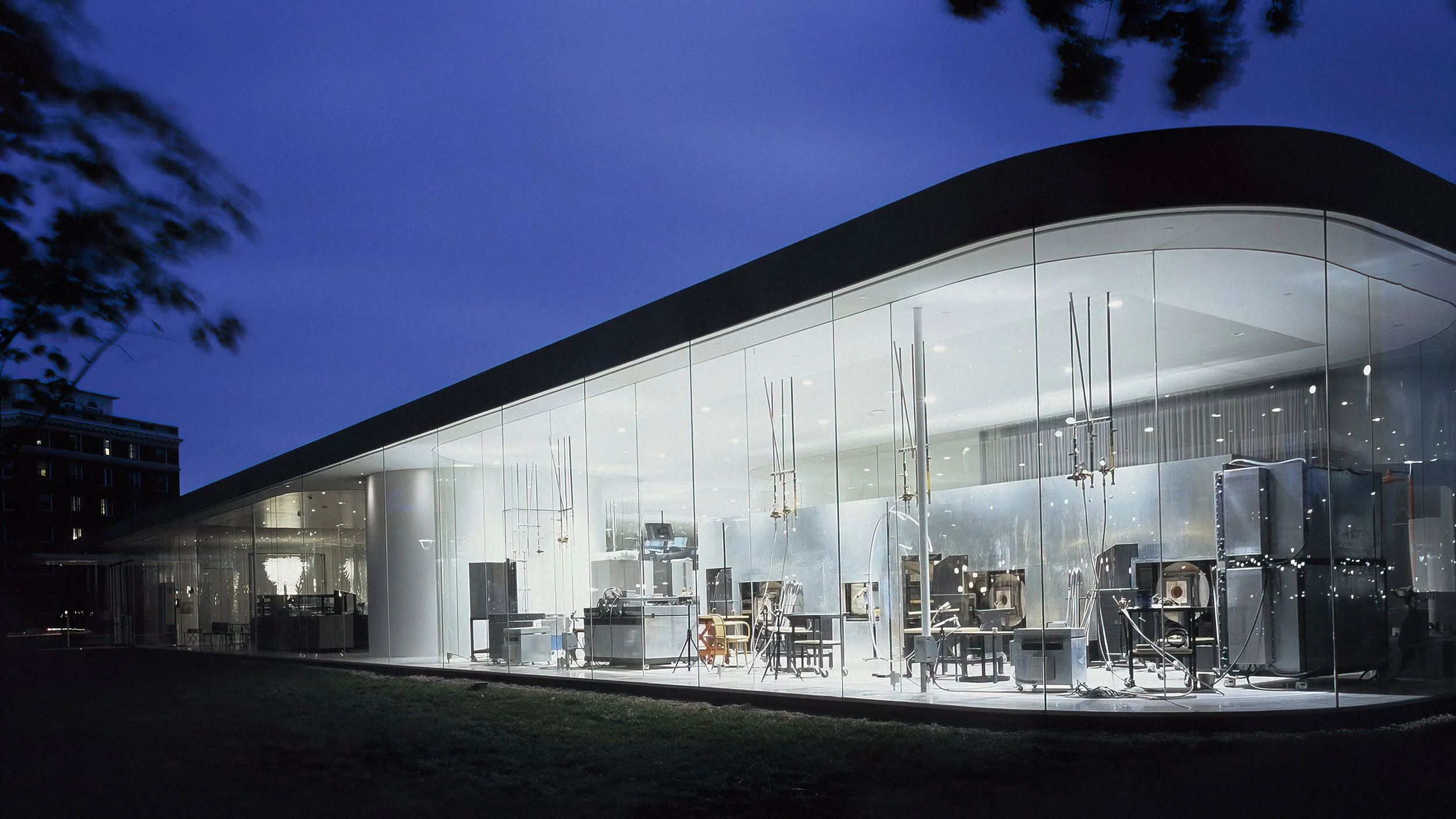
And paying homage to Toledo’s history as The City of Glass, the alchemy and symbolism of glass is infused with the identity and applications, from digital to across the campus. The “T” acts as an adaptive prism, absorbing and reflecting the qualities of the artwork within view.
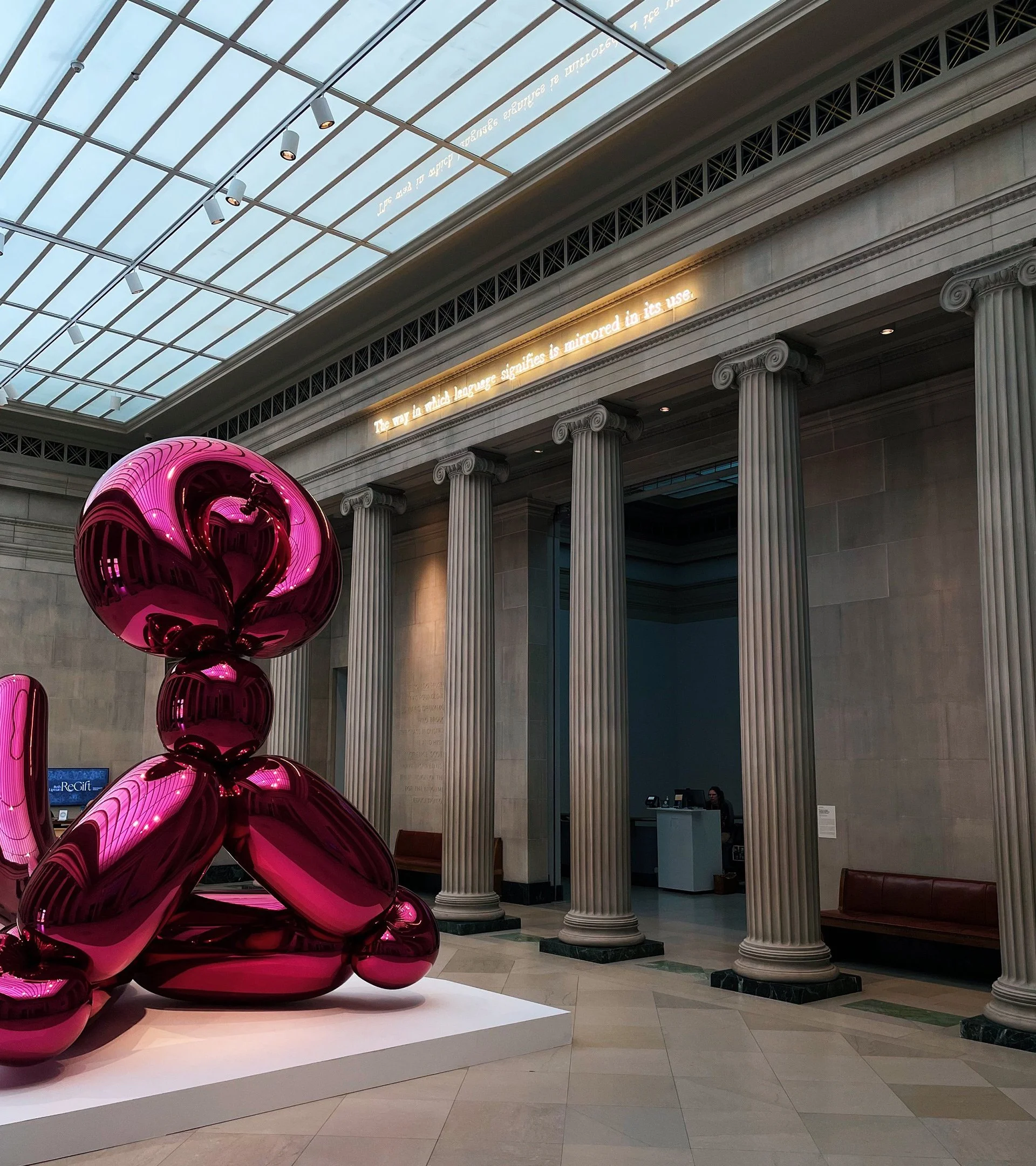
This is a brand identity that expresses the bold confidence of TMA — moving out into the community, revealing new perspectives, and shaping the future of where museums go next.
-
Client: Toledo Museum of Art
Adam Levine, Museum Director
Gary Gonya, Director of Brand Strategy
Mark Yappueying, Graphic Design Manager
Aly Krajewski, Designer
Crystal Phelps, Marketing Manager
Agency: Lafayette American
Toby Barlow, Chief Creative Officer
Meg Jannott, Head of Design
Paolo Catalla (Semi:Formal), Senior Designer
Jon Wolfer, Senior Designer
Asha Cook, Designer
Cecilia Hong, Junior Designer
Aidan McKiernan, Copywriter/ACD
Beth Rea, Chief Strategy Officer
Doug James, Creative Strategist
Justin Morley, Senior Account Supervisor
Vu Nguyen, Associate Director, Project Management
Ben Bator, Chief Innovation Officer
Priya Tirtha, Senior UX Strategist
Web Development: Madhouse